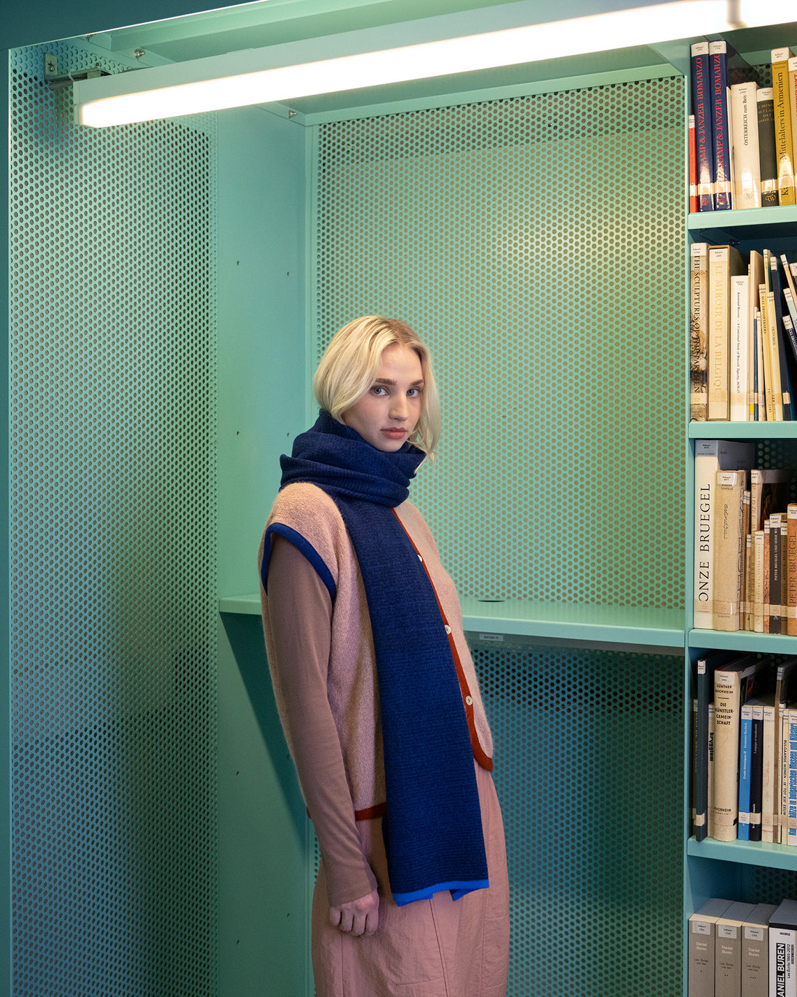
This collection starts from Times New Roman.
The boundary of recognition of both the typeface and text itself is explored in two directions, both zoomed in and zoomed out, using Times New Roman as a starting point: a classic serif typeface closely linked to literary print and deeply rooted in the collective memory.


Typographic forms & line breaks
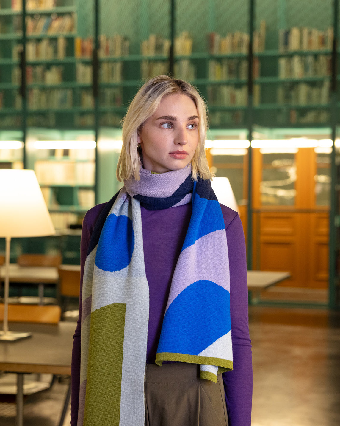
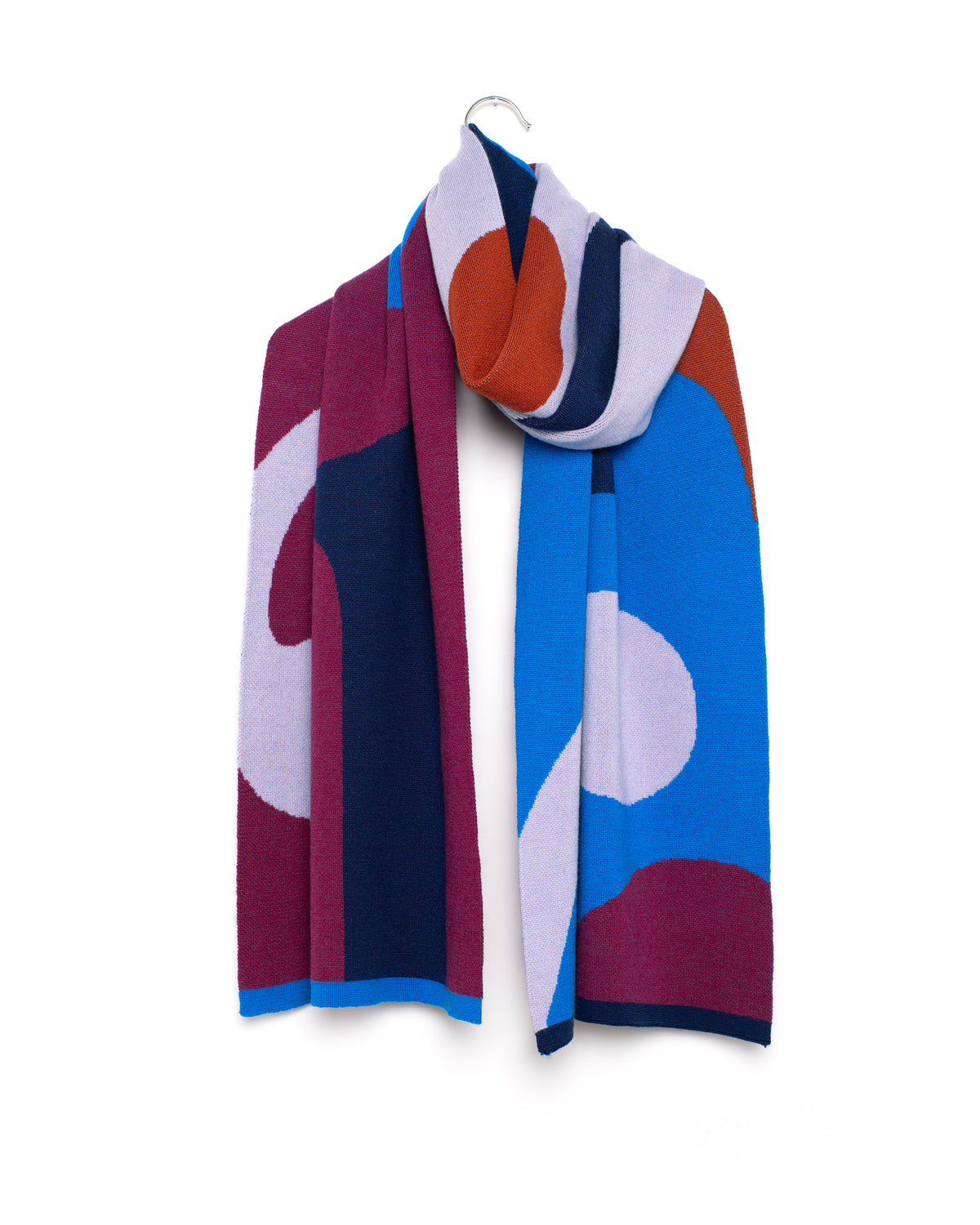
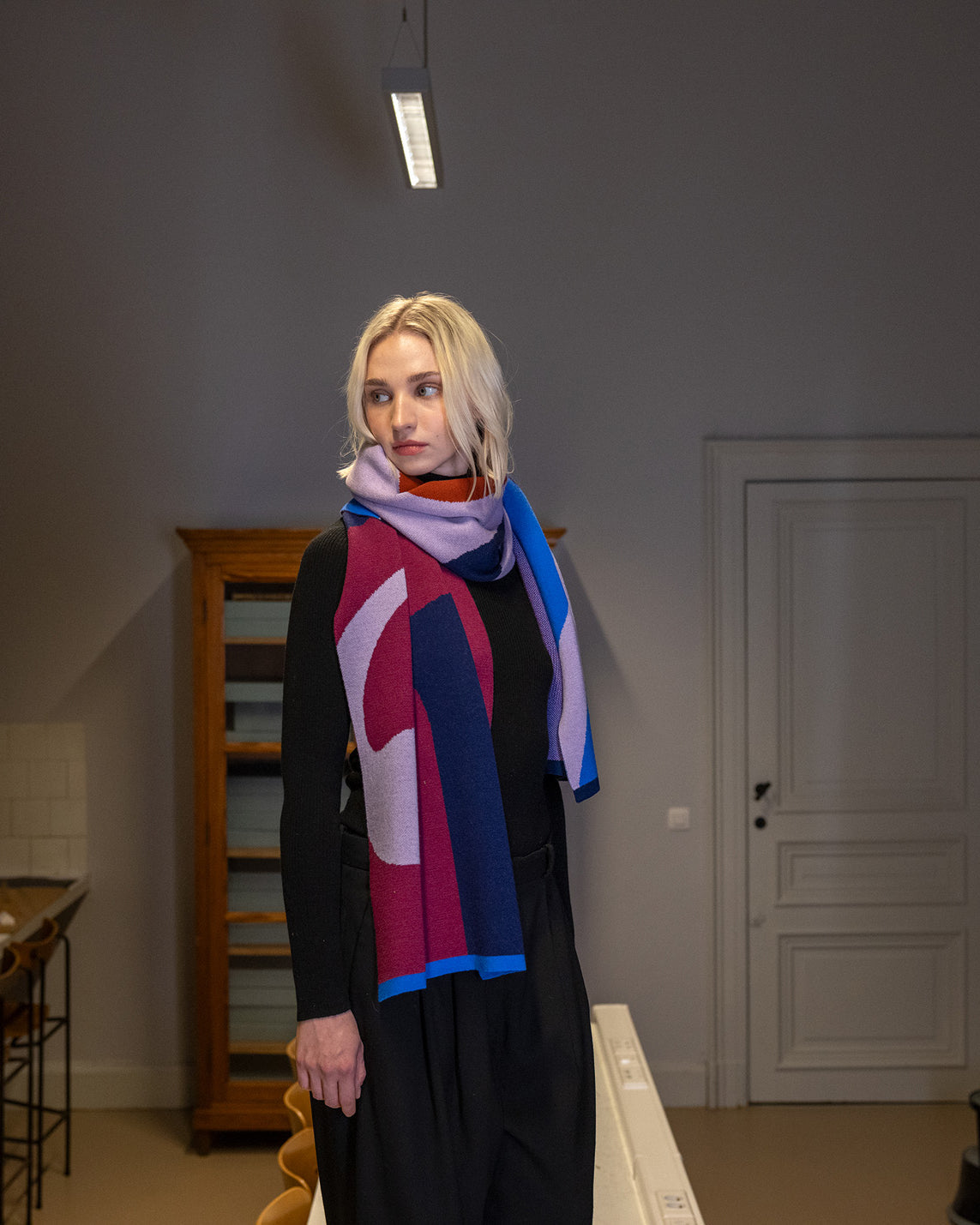
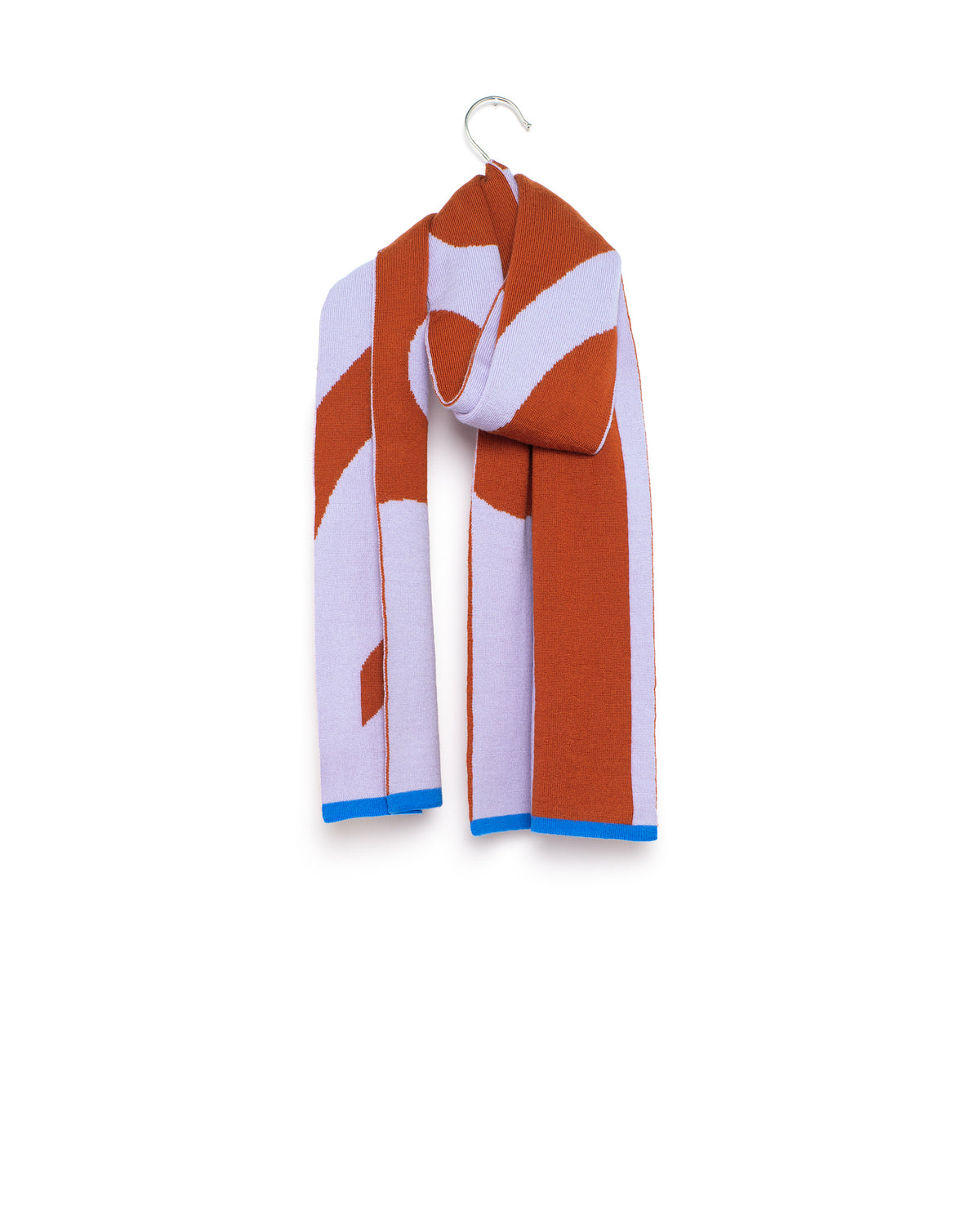
What first appears to be random geometry turns out, on closer inspection, not to be random at all. The transition between curves and straight lines, the seemingly arbitrary spacing between a circle and a stroke, and the cut-outs within solid shapes. These are precisely the details that trigger recognition: typographic forms, unconsciously associated with literary serif type.


Even when we zoom out, that sense of recognition remains. The places where the pattern breaks are read as line breaks in a text, but on closer inspection the image is already too far zoomed out to be readable.
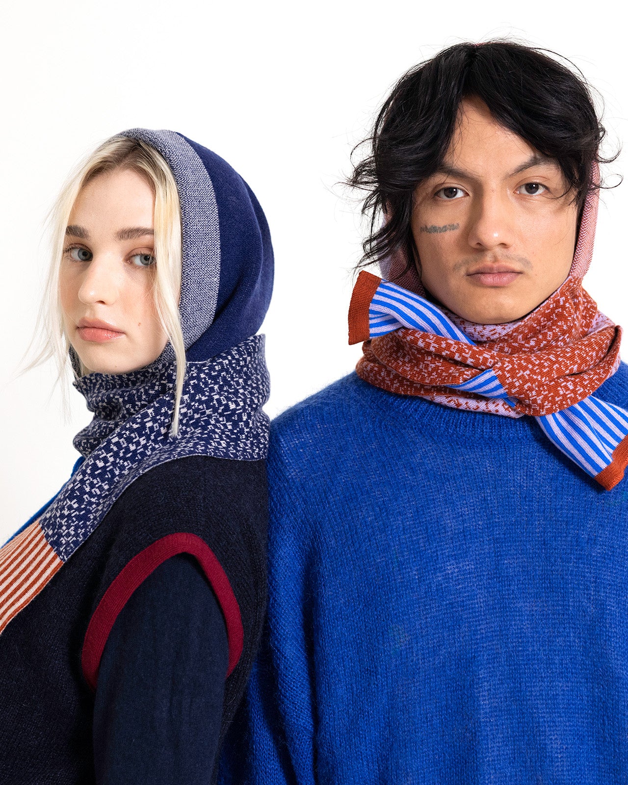
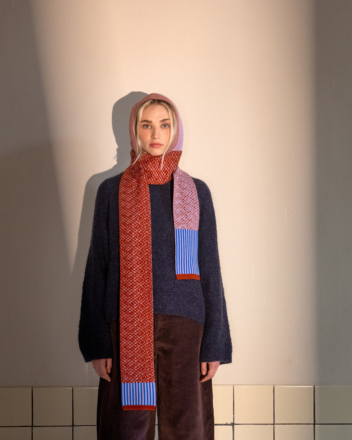
What remains is a field of rhythm and repetition, where individual letters lose their legibility and merge into a graphic pattern. Within that pattern, suggestions of book pages appear: fragments of text blocks, paragraphs, margins and empty areas that recall page layouts, without any actual text left to read.


All names in this winter collection are inspired by punctuation marks and typographic symbols: Apostrophe, Semicolon, Ampersand, Hyphen, Ellipsis, Parentheses, etc. The form or meaning of each symbol subtly refers to the garment itself.